


I was asked by Thomas Lahdesmaki from Forage Press a while back to answer this simple brief:
"Pick any musical subject matter as inspiration (genre, band, song, album, scene, era etc.) then produce an original series of images which interprets and/or tells the story of that subject in some way, abstract or literal"
The piece of music that I chose is Arthur Russell's "You and Me Both" - specifically this Youtube version which its accompanied by a video of people dancing in Brooklyn in the early 90s.
The video edit is obviously made up of clips chosen from a different era (it’s more likely there dancing to something like Junior Vasquez) but somehow these two pieces come together in a beautiful, dreamlike way. The pumped up poseurs and Guido's on jet skis seem to create a direct juxtaposition between the innocence and intricacy of Russell's music.
With the imagery I wanted to play with the notion of two separate themes coming together to create an abstract, ambiguous third meaning.
Click here to see other artists interpretations of their favourite records. And look out for the book version of this project coming soon....
THE ATLANTIC, THE NEW STATESMAN AND NEW SCIENTIST MAGAZINES.
by jimmy turrell on Wednesday, 24 September 2014


Heres a few illustrations I've recently completed for The Atlantic, The New Statesman and New Scientist magazines.
The first is for The Atlantic Magazine in New York. The article is basically about the dichotomy of humour and sadness in Robin Williams.
It was a strange one this - its the first commission in a while that's really effected me. Looking through old images and video of him made me realise just what an incredible talent he was and how many great movies he actually made. The article concentrates a lot on his performance in Mrs Doubtfire but for me The Fisher King and Good Will Hunting will always be his stand out performances. Such a sad loss. Click here for an amazing tribute by David Letterman.
The second is for a poem called "Poundland" by Simon Armitage. Click here to read it. The fact that these places even exist, the impending doom of loan sharking and people generally struggling to make ends meet are all points covered in the poem. I did three sketches for this one. The first one the art director thought was a bit too poppy and colourful. He had a point I think. So I went for a more more sinister feel for the next two. They eventually went with the red version at the bottom.
The last illustration is for a New Scientist feature about new techniques of fighting cancer. One is called called the "Tumor Trap" and basically helps the good blood cells in our cardiovascular system round up the bad cancerous cells.


Click on images to enlarge....
I was asked a few weeks ago to illustrate an article for The Guardian on Margaret Thatcher’s privatisation policies in the late 70s and 80s. As someone who’s grew up in Newcastle Upon Tyne and who’s dad worked in Swan Hunters shipyards as a teenager and then went on to become a fireman and staunch union member this particular article connected in more ways than one.
The article basically describes how Thatcher sold off public monopolies, using the proceeds to cut taxes, and then put the privatized firms on a strict profit-making basis.
I basically wanted to portray Thatcher as the “grand auctioneer” - at her reach are the public companies (its actually quite nostalgic to see a lot of these logos now) dropped into price tags ready for the big sale.
Click here to read the article.


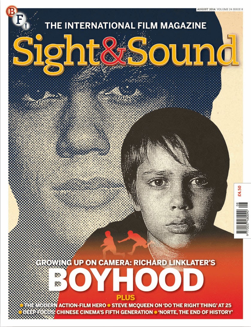
I've always loved Sight and Sound magazine - published by the BFI and along with Little White Lies definitely the best movie magazine out there. Its been a pleasure to work for them illustrating the articles below.
The first one is of Polish film director Walerian Borowczyk described by film critics as a 'genius who also happened to be a pornographer'.
Borowczyk’s films, which often look like a carefully animated paintings are invariably about sex, love and death. He was a surrealist and a provocateur and I wanted to communicate this within the illustration.
The next two are options that I did for the magazines cover of the new movie Boyhood. Its basically a coming-of-age drama directed by Richard Linklater which incredibly was shot intermittently over an eleven-year period from May 2002 to October 2013 as the main actor, Ellar Coltrane grew from childhood to adulthood. I wanted to communicate the complexities that this journey can often lead to so kept the the tones and textures quite dark while adding playful silhouettes of childhood to add balance. I also two images of Coltrane at the beginning and end of the process. The chosen cover was the simper version at the bottom.
Click here to watch the films trailer
Big up to art director Chris Brawn for the commissions


I purposely try to stay away from the featured artist's existing album artwork in order to put my own stamp on each portrait. An album or song title can also help spark an idea or concept for each piece. For instance I jokily referenced one of David Ickes main conspiracy theories for the self titled album from Royal Blood - i.e. that the British Royal family are reptilian humanoids controlling humanity. Or by using the simple dove image for Morrissey's "World Peace is None Of Your Business"
Also included here are illustrations of La Roux, Metronomy, Jungle, Ratking, Merchandise, Wild Beasts and Warpaint.
Click on the images to enlarge.
To see the full list including Paul McCartney and Damon Albarn - check out my website here: www.jimmyturrell.com


Heres the new TV and print campaign that I've worked on for Bartle Bogle Hegarty and their clients Ladbrokes.
The new campaign tells the story of five friends - The Believer, Generous John, Mr. Brightside, The Professor and The Gut Truster, who represent Ladbrokes online customers.
I created all of the illustrations for the campaign - the freeze-frames portraits for all six TV ads (subtlety animated by the guys down at The Mill) and a print campaign which features each character used across a variety of media including 6-sheet posters, magazine/newspaper ads and instore displays.
I was basically commissioned to elevate the classic British "everyman" character into someone who is strong and stylish but at the same time doesn't take himself too seriously.
A used a limited colour palette, bold contours and strong shadows to try and give a sense of power and dynamism. I tried to stay away from a vectorised (and in my opinion often sterilised) feel so all of the portraits are drawn by hand and the use of textured, slightly offset printing hopefully gives the portraits a more individual character.
Its been a great campaign to work on so thanks to Louisa Gray (Producer), Shish Patel (Creative Director), Emmanuel Saint M'Leux (Art Director) and Rachel Hough (TV Producer) for all their hard work and energy.
Look out for more TV ads + posters over the next coming months……
 Heres tomorrow's Guardian Guide cover of Beck that I've been working on this week. I also thought I'd take you through the creative process while working alongside The Guide's art director Sara Ramsbottom.
Its for an article on Beck's new album Morning Phrase and the key words in the brief were Ethereal, Woozy, Organic, Sunlight and Tripped Out. I wanted to go for a psychedelic feel (with a hint of darkness) while still keeping a modern sensibility and above all not allowing the portrait of Beck to get too lost in the elements that surround him.


-
The backgrounds on these first attempts hinted at things like lava lamps and planets but we soon agreed that the colours needed to be more organic and sun kissed rather than bright purples and blues.

We started by using this wider shot of Beck but soon realised it would be better to crop into his head if we wanted to communicate the feeling of tripped-out psychedelia. I also removed the outline around Becks body as it created the feeling that something was locked in rather than something that was more expansive.

 I also started adding more geometric shaped to hint at a more kaleidoscopic feel. These were the last two attempts before we went to final. The last one was pretty much the basis for the final with some small tweaks. I made the background more symmetrical and also darkened his hat as it was getting slightly lost in the background. I also brought out the contours of his face more and worked textures into the Guardian logo so it became a part of the illustration . Also here's a GIF to show more of the stages.

Heres a sneak peak of this Saturday's Guardian Guide cover that I created. Pop back tomorrow for a step by step process of how the final was reached.