
New work for The New Yorker, Seattle Met and unused Yellowire.
by jimmy turrell on Thursday, 16 February 2012


Heres a couple of illos I've done with pretty quick turnarounds - one for The New Yorker and one for Seattle Met magazine. The New Yorker one was for a review of Steven Soderbergh's new movie Haywire and the Seattle Met piece was for an article about a man who was taken by a Nigerian Petroleum email scam and then flipped it around and duped hundreds more people in the U.S. out of millions of dollars.
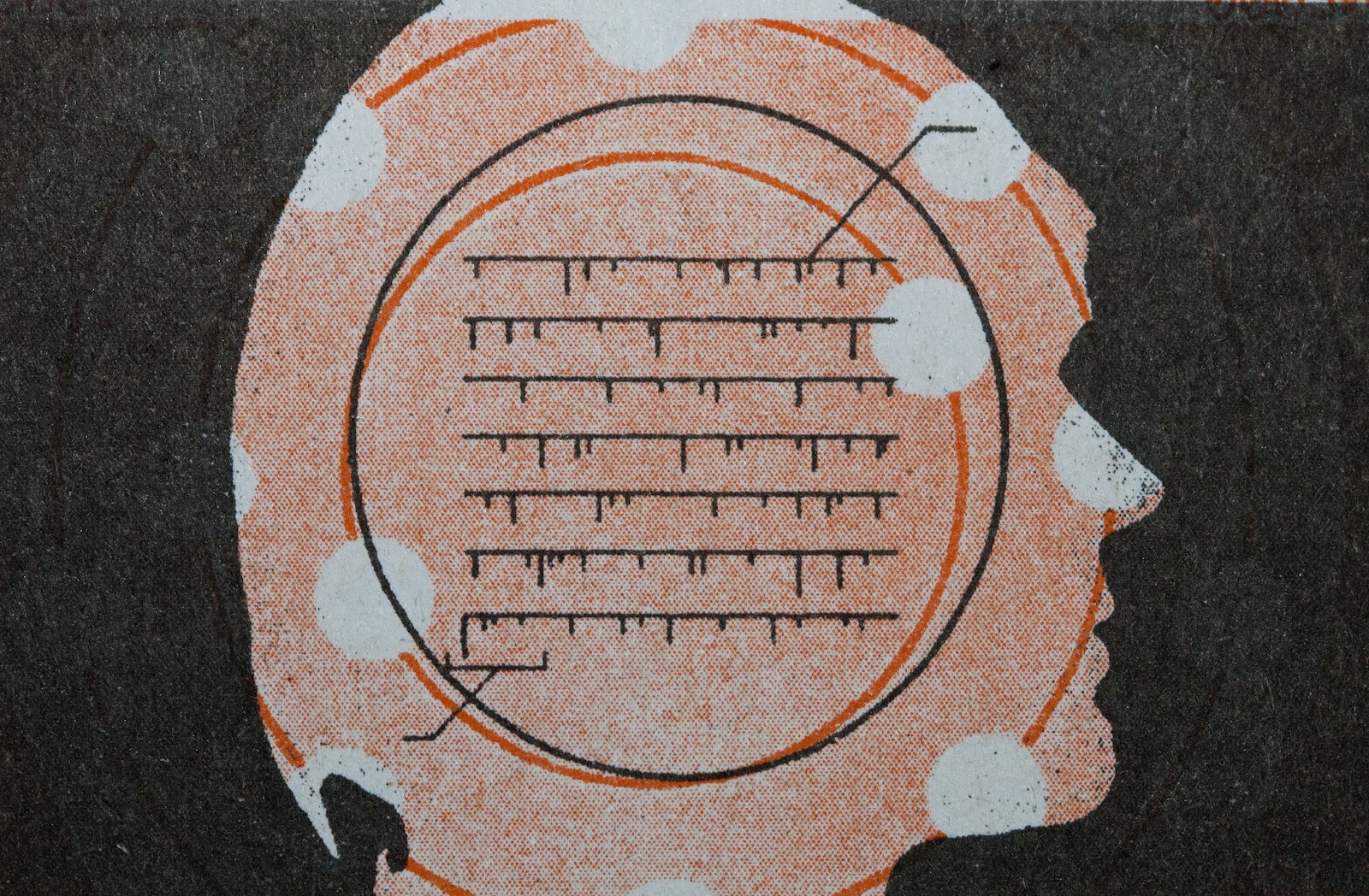
Also included here is a few Yellowire siloutte experiments I found in the bottom draw yesterday that never got used for various reasons.


Last month I mistakenly deleted the interview I did with IDN magazine last year from my blog. Only just got the chance to upload it now so here it is again for the few people who asked:
IdN: How would you describe your work / style to those coming across it for the first time?
I guess a lot of my work is steeped in nostalgia but I try hard to examine it in a contemporary setting. I try to use methods that produce strange (and often awkward) combinations of images and ideas.
Mixing analog techniques from the past with imagery and subject matter from the present can create strange hybrid worlds - which in themselves feel new and of their time.
This often means my style is quite diverse - it can jump from hand painted portraits to complex collage work to very simple graphic pieces - though hopefully a certain spirit runs throughout.
IdN: The colours in your works are quite contrasting - how do you see the relationship between color application and retro / nostalgia?
In terms of direct influences a couple of things really stick out from my childhood that I think have affected my understanding of colour and its nostalgic qualities.
I grew up in The Byker Wall in Newcastle Upon Tyne, a huge council estate development built by the architect Ralph Eskine. At the time it represented a major break from the high-rise Brutalist architectural orthodoxy in Britain and rather than dull concrete tones I grew up around complex, textured facades, colourful brick, wood and plastic panels. I was surrounded by bright, primary colours everywhere I looked and this definitely left an indelible mark on me and consequently my work
Also as a young boy I distinctly remember being entranced by my Dad's copy of Disraeli Gears by Cream and being totally blown away by the fluorescent pink artwork on the cover.
He also had old copies of Oz and International Times which also effected my appreciation of colour within print. Later on as a student I became a big fan of 60's Polish and Cuban poster art which again utilized the same bright, poppy colours.
IdN: How you would describe the term retro and how you would title works as retro / nostalgia?
It's sometime hard to know what constitutes as "retro" now as the world around us moves so quickly, but in my eyes the best work does more than just mimic past styles by simply duplicating whole movements within design history. It does however have a healthy respect for its source material and forms an aesthetic that can create a specific mood or awaken memories within people while still creating something vibrant and fresh.
Sometimes the most interesting work can come from an individual not truly understanding or even experiencing that aesthetic first hand. I grew up in the Eighties but I feel that my take on the Sixties has a certain warped twist to it - like I'm trying to experience the decade vicariously through my work but then getting it slightly wrong. Which can then throw up interesting results.
IdN: From your perspective, what role does retro / nostalgia play in popular culture?
The past in itself is vital to popular culture as it represents the main source of the reference points that inspire us. So whether it's Push Pin being inspired by 19th Century Victoriana, The Psychedelia movement referencing Art Deco or even say, LCD Soundsystem being influenced by Krautrock - in some sense every creative person is looking for guidance from the past in some way.
Its how we adapt, integrate and make relevant those influences that's most important.
IdN: Making retro / nostalgia work with up-to-date technology / software actually is a bit contradictory. Whats your take on it?
In terms of technique I tend to try to explore as many different pathways as I can. I often use classic methods (screenprinting, watercolours and inks) and antiquated technology (old fax machines and typewriters) to examine very contemporary subject matter - and vice versa. As long as it's honest I don't think there's really a right or wrong way to create this type of work.
Its almost a re-imagining of the past and it holds a yearning for a more idealistic time.
Movements such as Retro-Futurism and Steampunk take it one step forward - taking depictions of the future created in the past and then updating them for the 21st Century. This might sound paradoxical but this collision of ideas and themes has truly helped to create new aesthetic languages.
Nostalgic design is often bolstered by optimism about human potential and the so called "good old days" but at the same time it can suggests a half ironic, half melancholic longing for the past that i think we can all appreciate.